Thank you so much to everyone who voted and commented! I really appreciate the input (plus it’s super-fun to see what people think!).
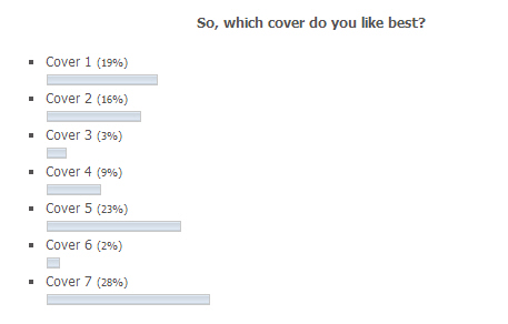
The results were pretty close with 7 winning out over 5.
With the comments and private emails I have received, it’s clear that the font used in 5-7 is preferred, and that images from 1 or 2 might be reusable on covers with that font. And many of you expressed the opinion that they were all cheesy *laugh*. I have really appreciated all the feedback.
I’ll confess that I’m still considering other options because I just can’t get excited about any of these (ref: the ‘perfectionist dithering’ I mentioned here).
I think that the favourites you have identified are totally usable, and I’m absolutely taking all of the feedback on board, but I’m still dissatisfied.
I feel like this is my baby and I want a cover that I look at and go ‘Fuck yeah! THAT!’, and none of these hit that mark for me.
Rest assured that I am determined to get this book out soon, whether I get something I love for the cover art or not.
Stay tuned.


